One of the many things an aspiring collodion artist has to take into account when making an image (and there's a long list!) are the colors that comprise the composition. "But wait," you say, "this is black and white photography--why would color matter? Isn't it all just shades of gray with some black and white in there?" Well, the short answer is no.
Collodion, a mixture of nitrocellulose, diethyl ether, and ethyl alcohol that has been "excited" by the addition of halide salts such as cadmium bromide and ammonium iodide, is highly sensitive to ultraviolet (UV) light (actinic or blue light) and it is least sensitive to red/orange light. Things that we perceive as blue will appear as white--or very light colored--in the resulting image, while red/orange objects will appear black--or very dark colored. To the degree that a color we perceive contains blue or red/orange (or even yellow), it will appear lighter or darker in the image--various shades of gray.
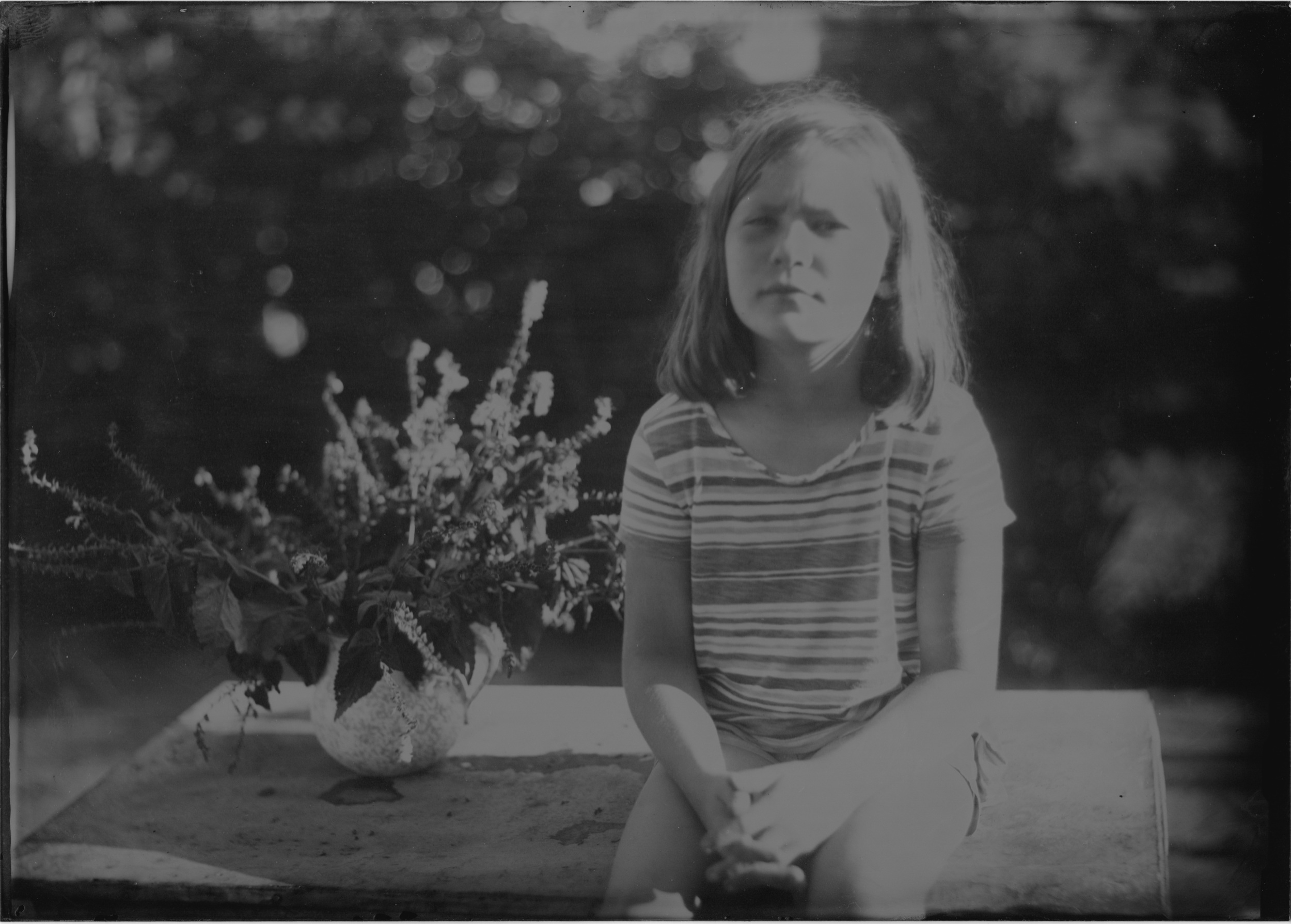
So when I'm setting up a still life, or working with a model, I am very aware of the colors and try to anticipate how they will translate to the final image. Compare these pictures of my daughter wearing her favorite striped shirt.
The blue stripes appear as a light gray, while the red, orange, and yellow stripes are much darker. The flowers in the pitcher are actually dark purple/blue, but here they appear as almost white.
Sometimes there are some surprises, such as this still life of my bowling ball and shoes.
Here, I see (and my iPhone saw) a pair of black and white shoes and an acid green bowling ball against a very light green background.
And here's what the collodion "saw" (from a corrected scan)
Everything but the bowling ball came out much as anticipated. It seems that light from the ball had much more yellow than blue, so it came out as black, except for the lighter swirls and lettering and, of course, the shiny area. Not knowing exactly how an image will come out keeps the process fresh and exciting for me.
A portrait of my daughter from last summer....
And another picture of her wearing the same shirt (her favorite!)


